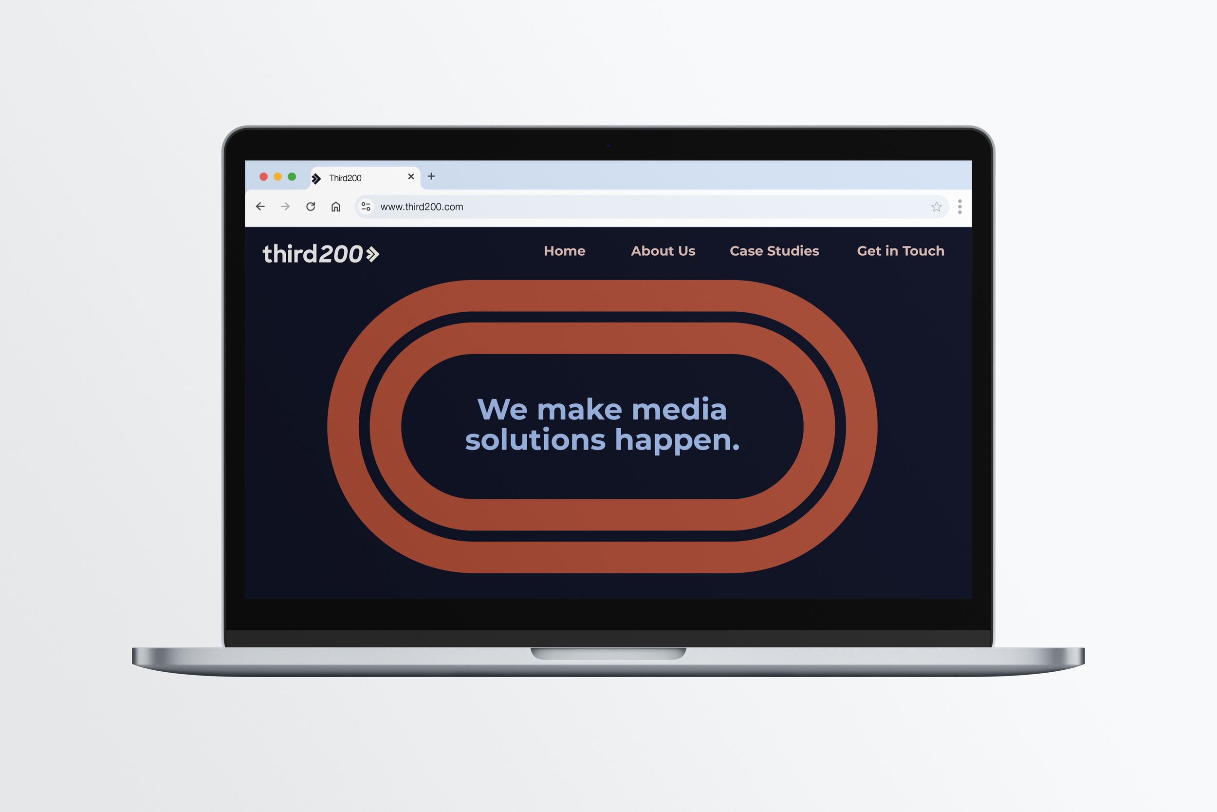
THIRD200 STRATEGIES
Third200 Strategies is a media consulting firm founded by a former newsroom leader to help organizations navigate high-stakes, defining moments. The brand identity was designed to feel fast, modern, and confident, while subtly honoring the founder’s roots in traditional media. The name Third200 references the third leg of the 800-meter relay, often the most demanding stretch, where athletes must dig deep and push through pressure. That idea of resilience, momentum, and performance under pressure became a guiding concept throughout the identity, with select visual elements inspired by the world of track and field.
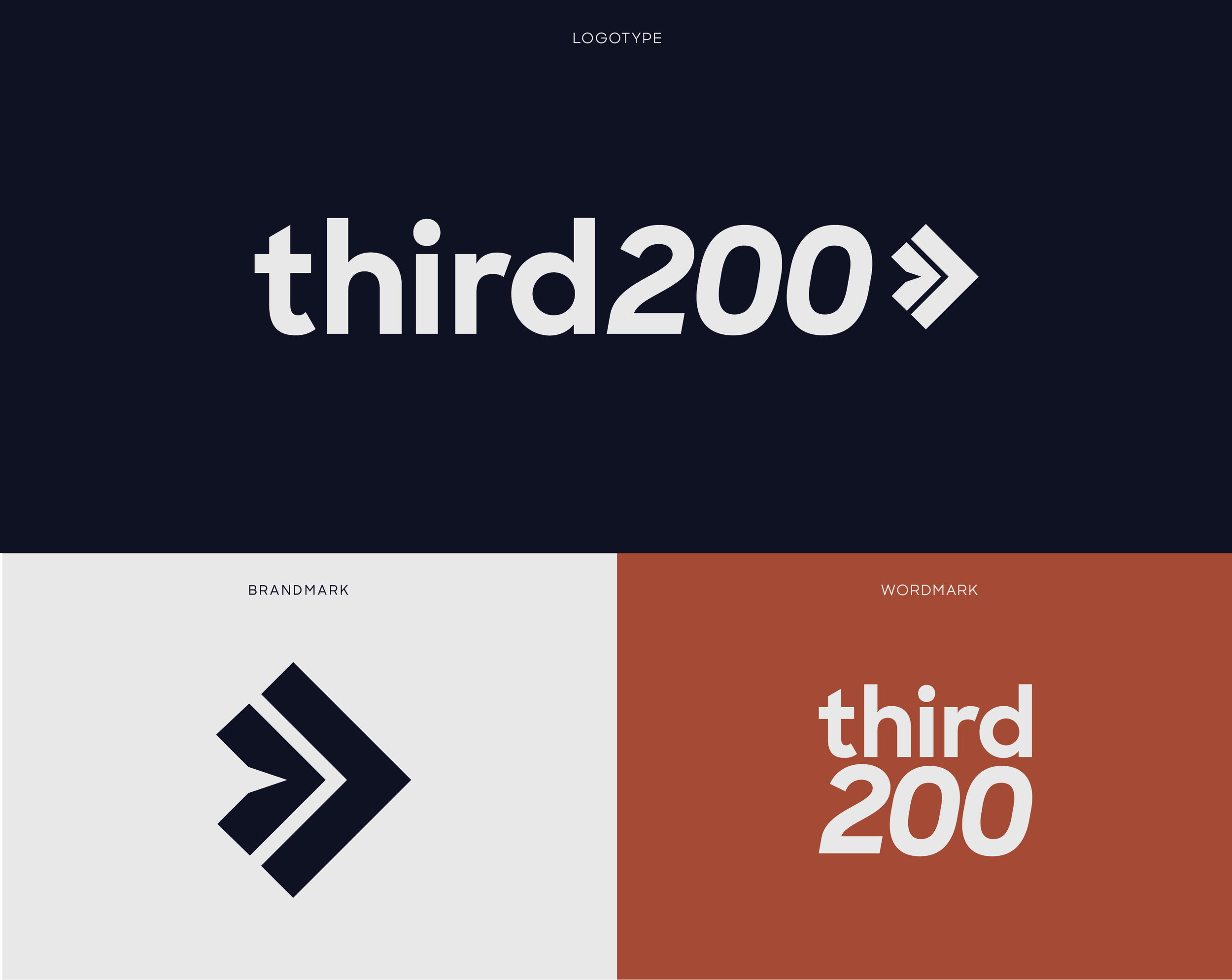
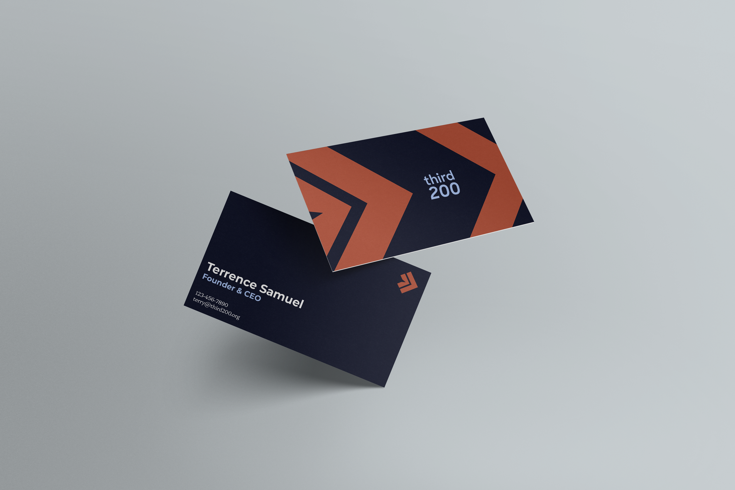
The brandmark is a visual reference to the “Third” in Third200. Through the use of negative space, the cutout to the left of the arrows creates emphasis on the third space. The arrows symbolize forward momentum and progress, while also nodding to the triangular lane markers found on a running track. The typography reinforces this sense of motion, with the italicized “200” adding energy and pushing the logotype in a dynamic, forward direction.
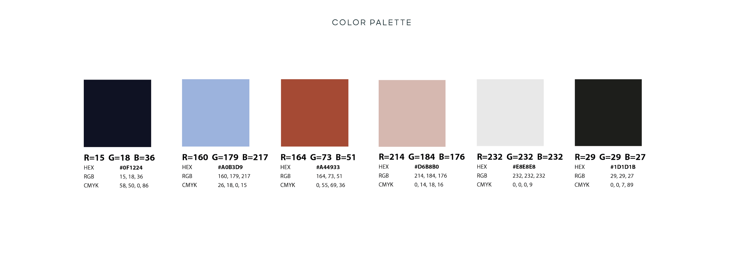
The color palette centers on two primary tones: navy and rust. Navy conveys trust, stability, and experience, reflecting the firm’s credibility and strategic expertise. Rust serves as a subtle nod to the color of a running track, reinforcing the brand’s athletic inspiration. Supporting lighter shades of both colors help round out the palette, alongside an off-white and black for added versatility and balance.
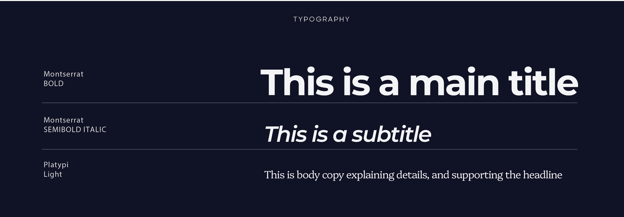
The primary display typeface is a bold sans serif that reflects the firm’s forward-looking perspective. Its sharp corners and angular construction complement the defined geometry of the brandmark, creating a cohesive visual system. The secondary body typeface is a modern serif with similarly angular characteristics, balancing contemporary sophistication with a subtle nod to the founder’s traditional media background.